The world of graphic and web design is complicated and there is a lot of terminology out there to learn. To help you out, we’ve put together a cheat sheet with answers to some of the top graphic design questions we’ve heard.
1. What are pixels?
A pixel is the smallest element in a digital image. It is a single square that is a part of a grouping of squares that make up your image. The number of pixels you have in each direction (height and width) determines the size of the image. For example, if you have an image that is 125 px x 125 px, that means that your image is a square and is 125 pixels high and 125 pixels wide.
2. What does ‘vector’ mean?
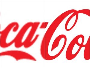
A vector image is made of points instead of pixels. What that means in layman’s terms is that a vector image can be blown up to a much larger size without being blurry. On the image below, the logo on the left is a raster image and the logo on the right is a vector image. See how the left image doesn’t stretch very well?

The reason for this is that the points join paths (think, connect the dots) whereas with pixels, there are only a finite amount. So, it would be like the difference between trying to stretch a piece of denim versus a piece of elastic. You may also hear vector files referred to as AI files because vector artwork is typically created in Adobe Illustrator.
3. What are CMYK and RGB, and what’s the difference?
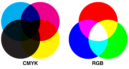
These are color modes for images either on a screen or in print. CMYK stands for Cyan, Magenta, Yellow, and Key (which just means black) and RGB is red, green, and blue. CMYK is used for printing and is often called ‘4 color process’ or ‘4 color printing’ while RGB is used for devices with a monitor, like a TV or a computer. Keep in mind, if artwork is created in RGB, it might look great on screen however it will print out a different color in CMYK!

4. What are a few terms I can use to better communicate with my development team?
Web designers are notorious for using technical terms and buzz words. Here are a few essential web design terms everyone should have some understanding of:
Responsive design: A web design that adjusts the layout for different screen sizes. Think of viewing a website on your computer, and then viewing it on your phone. On a responsive website, the elements should adjust to allow a functional and more pleasant viewing experience.
Below the fold: Refers to the area of a web page that the user must scroll to see (you’ll want to place your most important content above the fold to get the most visibility)
Resolution: The number of dots per inch (72dpi for the web; 300 or higher dpi for print)
Web-safe fonts: Fonts that are available on most operating systems like Windows and Mac (e.g. Arial, Georgia, Times New Roman)
Web colors: A hexadecimal code representing the color you want to use on the web (e.g. #ff0000 for red)
5. What in the world is PANTONE?
PANTONE Color Matching (aka PMS) is a standardized color matching system that allows a designer to accurately match a color across all forms of media. The reason this is important is because the red I see on my monitor might be vastly different from the red you see on your monitor depending on the settings. A PMS number tells the printer how much of each color to use when printing an image. So, if your logo is PMS 187, the printer would use a certain percentage of the CMYK colors every time, so you know you’re getting the same color even if you are printing from different printers.
6. What are the differences between file types?
The three most common file types for web-based images are .jpeg, .png, and .gif. Here’s a rundown of what makes each other them different.
JPEG – JPEG images are ideal for files with gradients and allow for a smaller file size through compression
PNG – PNG images are lossless, so they do not lose quality during editing, support transparency, and tend to be larger than jpegs
GIF – GIF images are able to maintain a low file size while being able to support animation
A few other common file types like .pdf, .psd, and .ai, refer to the format of the file and/or where it was created.
PDF – Incorporates all the elements of a printed document as an image that you can view, print, or send to someone else
PSD – Refers to a file created in Adobe Photoshop
AI – Refers to a file created in Adobe Illustrator
7. What about “proof” vs. “print-ready”?
Oftentimes you might be asked for a proof or a print-ready file. The main difference between the two is the file size. A proof is a much lower resolution version of the actual file which is ideal for sending via email so the recipient can see a visual representation. The print-ready file, depending on the size of the item you are printing, could be extremely large and possibly take a long time to download, or even require a special delivery method such as We Transfer, Dropbox, or Hightail. You can also distinguish a print-ready file by some other features like crop marks, registration marks, or color bars.
Hopefully, that clears things up a bit for you and you feel ready to take on the world of graphic design. If you need a virtual mockup of your logo on one of our products, we’ve got you covered! Contact us today, we’d be happy to help you out!